


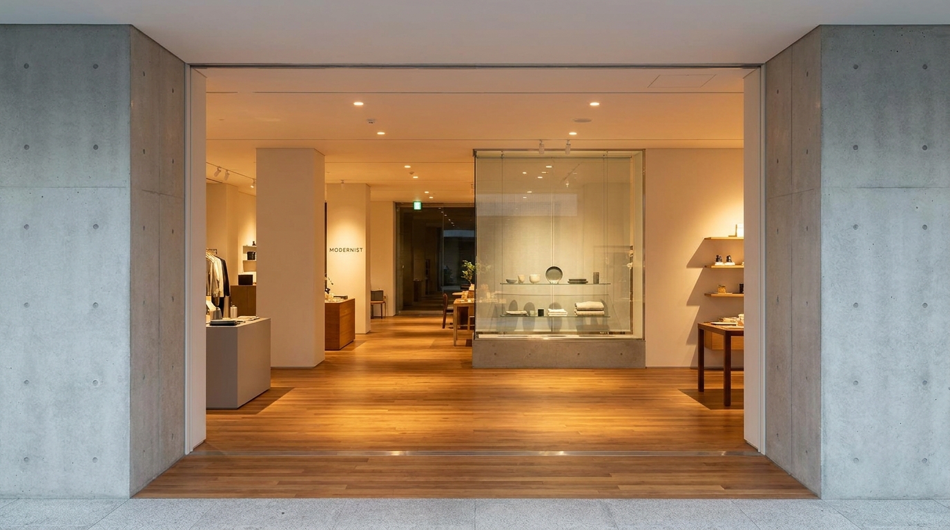
Most retail owners walk into a design meeting thinking about looks. What colour the walls should be, what fixtures go where, whether to keep the ceiling exposed. That is the wrong starting point.
A retail store layout is a behaviour tool. Good store design that sells makes people walk further into the shop and reach the counter with something in their hand. Bad design loses customers in the first ten seconds and never sees them again.
Here is what real retail interior design does inside a store, and where Jakarta stores keep getting it wrong.
The first fifteen feet decide everything
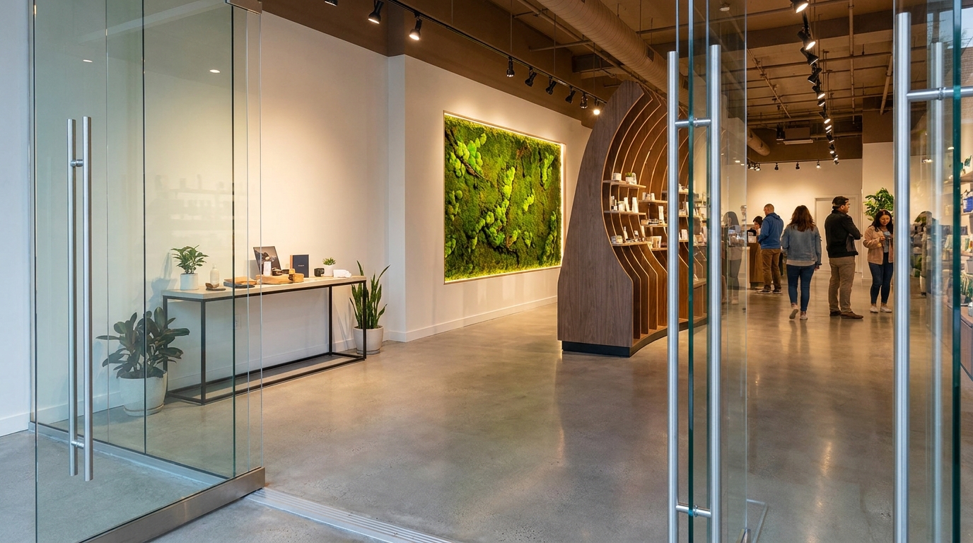
The area right inside your entrance has a name in retail design. It is called the decompression zone. It is where customers adjust from outside to inside, and in Jakarta that also means adjusting from thirty-three degrees and glare to cold, dry air.
Customers do not register products, prices, or signage in this zone. Their brains are still catching up. Putting your best merchandise or a promo table right at the door is one of the most common mistakes we see. Shoppers walk past it without noticing.
Give this zone room to breathe. Leave the first three to five metres open. Use a strong visual anchor further inside to pull people in, not a wall of product they will not read.
There is one more job this zone does. It tells the customer what kind of shop this is within about two seconds. A slick fashion boutique with a pile of clearance stock at the door signals confusion. A jewellery shop with cluttered glass cases feels cheap before anyone looks at price tags. The first impression is not the product. It is the space.
How customers actually move through your store
After the entrance, most customers turn right. This is a well-documented pattern in retail research. The wall on their right becomes what merchandisers call the power wall, the highest-visibility surface in the store. Put your new arrivals, hero products, or seasonal storytelling there.
From there, layout choice shapes the whole trip. Three patterns dominate.
Grid layouts work for supermarkets and pharmacies where customers know what they came for. Straight aisles, everything findable, no wandering encouraged.
Loop layouts guide customers on a circular path past every category. Common in apparel and homeware. IKEA is the extreme version.
Free-flow layouts have no fixed path. Fixtures are placed to create clusters and pauses. Boutiques use this when they are selling browsing, not purpose.
Sightlines matter more than layout type. Customers need to be able to see the back of the store from the front. If they cannot, most of them will not walk that far. Tall central displays that block the view kill your back-wall real estate, and the back wall is usually where fitting rooms, feature products, or the highest-margin range sits.
Wondering if your store layout is working against you? A walkthrough of the real space usually shows where customers are dropping off.
Fixtures, lighting, and the fitting-room test
Product placement height is a boring detail that costs stores money. Eye level is buy level. The band between roughly 120 cm and 160 cm from the floor gets the most attention and moves the most stock. Low shelves need bold, low-priced items. Above 180 cm should be branding or category signage, not product you actually want to sell.
Lighting is where cheap retail interiors give themselves away. Flat overhead fluorescents make skin look grey, fabric look dull, and food look off. Retail lighting works in layers: ambient for general orientation, accent to draw attention to specific product, and warmer tones near mirrors and checkout. Warm 3000K light in a fitting room makes people look better in what they are trying on. That translates directly into sales.
For fashion, the fitting room is the single most important space in the store. It is where the buying decision happens. Cold light, a cramped cubicle, a curtain that does not close properly. Any of those turn a maybe into a no. Fitting rooms deserve better materials and lighting than the sales floor, not worse. Most designers reverse this.
Checkout usually belongs to the left of the exit path so customers walk past more merchandise on their way to pay. The counter itself is prime impulse territory. Small, high-margin items live there. Not clearance junk.
Retail design for Jakarta's reality
A design that works in a Munich flagship or a Melbourne boutique will not automatically work in a Jakarta store. The climate and the buildings are different.
Entrance transitions matter more here. Customers walk in from tropical heat straight into cold, dry air. If your entrance is a glass door directly onto the sales floor, the temperature shock and the wall of product hitting them at once overwhelms them. A short foyer or a soft threshold treatment gives eyes and lungs a beat to adjust.
Materials are the other trap. European timber panelling that looks warm in a showroom photo grows fungus within months in Jakarta humidity. SPC flooring in herringbone patterns became popular here recently. The foam underlayer detaches from the tile and starts curling within a year. We do not recommend it, however good it looks on a mood board.
Then there is the building. Mall retail units come with strict rules about work hours, service lift dimensions, and floor loading. An 800 kg stone counter for a second-floor Plaza Indonesia unit had to be broken into three parts and hand-carried up by eighteen men because the service lift could not take it. That kind of surprise comes from a designer who never checked the site.
CCTV coverage is another silent one. Fixtures and monumental displays that block camera sight lines create loss-prevention headaches nobody thinks about until stock starts disappearing. A designer who has fitted out banks and retail before will know to ask. A designer selling you renders probably will not.
What a good retail designer does before showing you a mood board
The most reliable warning sign about a retail design firm is what they do in the first meeting. If they open by showing beautiful past projects and asking what style you like, be careful.
A good retail designer starts with questions about your business. Who is your customer? What is their average basket? How long do they usually spend inside? What are you trying to sell more of? What is the operational flow from delivery to display to till? Renders come later, once those answers exist.
We work this way because most of the hiring mistakes Jakarta business owners make come from picking a designer on visuals alone. A retail space that photographs beautifully but sends customers home empty-handed is a failure. So is a beautiful layout that ignores humidity, CCTV, and building access.
If you are early in the process and comparing firms, our list of retail interior design firms in Jakarta covers who works this way and how they price. If the shop is small, some of the same thinking about sightlines and flow shows up in our notes on making a small commercial space feel bigger. Otherwise the practical starting point is a walkthrough of the actual space with a real conversation about what your customers do inside it.
Planning a new store or a refit? We work with retailers who want their layout to earn its rent, not just look the part.