


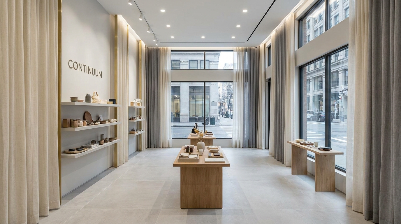
A 45 sqm shop in Kelapa Gading and a 45 sqm shop in Kemang can feel completely different. Same floor area, same lease, same ceiling height. One breathes. The other feels like you walked into a stockroom. The difference is not budget. It is a handful of decisions that most owners get wrong before the contractor ever shows up.
Small commercial space design is a discipline of subtraction. You are not adding features. You are removing the visual noise, the low ceiling lines, the choppy floor patterns, and the heavy furniture that makes the room feel smaller than it is. Here is the sequence we use on our own projects, in the order it needs to happen.
Step 1: Cut what does not earn floor space
Before you touch a wall or buy a mirror, walk the space with a tape measure and a notepad. Write down every object and ask one question: does it earn what it costs in square meters?
A four-drawer filing cabinet takes 0.5 sqm. In a prime Jakarta district, that is roughly IDR 2 to 3 million per year in rent just to store paper you probably do not need. Bulky reception counters, decorative planters that block sightlines, oversized signage racks, spare chairs stacked in a corner — these are the first things to go. Digitize what you can. Move archival storage off-site.
The goal is not minimalism as a style. It is honest use of space. If it does not serve a customer or a staff task daily, it does not deserve the floor.
Step 2: Lift the visual ceiling
Most small commercial spaces in Jakarta come with 2.7 to 3.0 meter ceilings. That is not high, but you can make it read higher.
Paint the ceiling the same color as the upper wall (or lighter). A hard line between wall paint and ceiling paint cuts the room in half vertically. Drop the line, and the eye keeps travelling upward. If you have a suspended gypsum grid, consider removing it entirely and exposing the slab. A painted black or dark grey slab with visible ducting reads as taller because the eye loses the reference point. Cafes on Jalan Senopati have been doing this for years.
Run vertical elements — tall shelving, floor-to-ceiling curtains, slim pilaster strips — from floor to ceiling. Horizontal features shrink a room. Vertical ones stretch it.
Step 3: Use one flooring, wall to wall
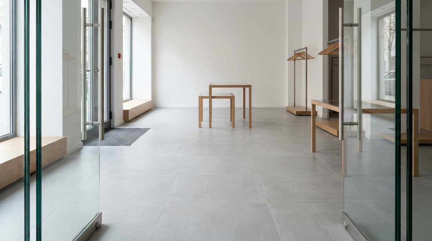
Choppy flooring transitions are the fastest way to make a small room feel smaller. A tile square in the entry, wood-look laminate in the seating area, epoxy behind a counter — the eye reads three rooms instead of one.
Pick one floor and run it wall to wall. Large-format porcelain tiles (60x60 cm or 80x80 cm) work well because there are fewer grout lines to break up the plane. Light neutral shades — bone, light grey, warm beige — bounce more light and hide dust from Jakarta's traffic. If you are working with retail or F&B, aim for a slip rating of R10 minimum in wet zones.
Avoid herringbone SPC laminate. It looks good on Instagram, but the foam underlayer swells in Indonesian humidity and starts curling at the edges within eighteen months. We have replaced it in more retail units than we care to count.
Step 4: Layer your lighting instead of relying on the ceiling grid
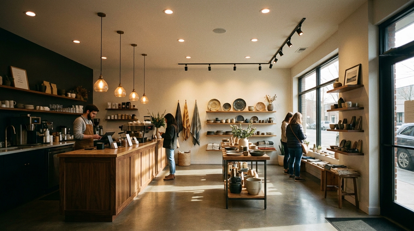
A single grid of fluorescent panels overhead is what makes an office look like a Puskesmas. Flat, shadowless, and depressingly evenly lit — the eye has nothing to lock onto, so the whole room reads as one small box.
Break the light into three layers. Ambient light for general brightness (dimmable LED panels or a few well-spaced downlights). Task light where people actually do work — the till, the espresso machine, the desk. Accent light on one feature: a wall of merchandise, a plant cluster, a piece of art.
Warm white (2700K to 3000K) in customer-facing zones. Neutral white (4000K) behind counters where staff need to see clearly. Never mix temperatures in the same visual field — a warm pendant next to a cool downlight looks broken, not layered. For more on how commercial lighting is planned properly, our notes on lighting design for commercial spaces go deeper on the calculations.
Step 5: Choose furniture that shows its legs
Solid-based furniture eats floor visually even when it does not eat much floor literally. A boxy sofa with a fabric skirt reads as a solid block. Swap it for a bench with exposed metal legs and the eye can see under it. The floor appears to continue. The room feels bigger.
The same rule applies to desks (open frame beats pedestal cabinet), counters (float them off the floor by 10 to 15 cm if structural cladding allows), and display units (open steel frames beat closed cabinets).
Scale matters too. In a 40 sqm cafe, a 2.4 meter communal table dominates and shrinks everything around it. Two 1.2 meter tables that can be rearranged serve more configurations and read as lighter furniture. If you are outfitting a small workspace, our small office design ideas for Jakarta piece has a good rundown of furniture proportions that work in tight footprints.
Working through a small commercial fit-out and unsure what to prioritise? We have done 700+ commercial projects across Jakarta and Tangerang, most under 200 sqm. We can walk you through what actually matters before you spend on the wrong things.
Step 6: Place a mirror where it doubles a real view
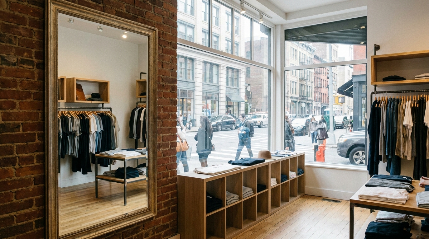
The mirror trick works, but only if you use it correctly. A large mirror bolted to a wall that reflects another wall does almost nothing — you are just showing the customer more of the same room they already see.
The right placement reflects a source of depth. A window with a street view. A doorway that opens to another zone. A long axis of the shop from front to back. Position the mirror perpendicular to the depth you want to extend, and the reflection reads as a continuation of the space, not a decoration.
Full-height mirrors are more effective than framed pieces at eye level because they carry the floor and ceiling lines through the reflection. In a small retail shop, one full-height mirror on the side wall opposite the entrance can add 30 to 40 percent perceived depth. In our retail store layout guidance we go into how mirror placement pairs with sightline planning.
Step 7: Strip out visual clutter before it accumulates
Small spaces have zero tolerance for chaos. A tangled power cable, a stack of promotional flyers on the counter, a sagging cork board of announcements — each item adds a little noise. Together they compress the room.
Plan cable routing during construction, not after. Run power and data through walls or under raised access. Cluster switches and sockets in one column instead of scattering them. Choose signage with two or three fonts maximum, not a wall covered in laminated A4 sheets.
Storage should be built in, not bought. Custom shelving that runs from floor to ceiling along one wall consumes less visual space than five loose pieces of furniture doing the same job. Painted the same colour as the wall, it can disappear entirely.
And keep the counter clear. In a small F&B space or reception, a cluttered counter is the first thing customers see. It sets the tone for how the whole room feels.
Getting the sequence right
None of these tricks work in isolation. A wall of mirrors above dark laminate flooring with a low grid ceiling and a giant sofa still feels cramped. The point is that these decisions compound.
Start with subtraction. Then work on the ceiling and floor as one continuous surface. Then lighting. Then furniture. The mirror and the storage come last, once the base is clean.
A well-designed 40 sqm space beats a poorly designed 80 sqm space every time. We have watched clients double their rent to solve a design problem that IDR 20 million of thoughtful planning would have fixed.
Planning a small commercial fit-out in Jakarta or Tangerang? Talk to us before you sign a contractor. A short review of your floor plan can save you months of expensive rework.